The realm of interior design, let’s be honest, can sometimes feel a tad overwhelming. A whirl of pronouncements on the latest, the greatest, the must-haves! One moment it’s a frenzy of geometric patterns, and the next, a singular jewel tone is proclaimed the season’s darling. Yet, amid this clamour for the novel, a quiet uprising is taking place. A growing cadre of design experts is making a case for the understated, singing the praises of those seemingly unremarkable shades some might deem “boring.” It’s Neutral Interior Design.
My friends, fear not! This isn’t a crusade against pzazz. It’s about grasping the enduring power of the subtle, understanding how a whisper of colour can profoundly transform your living space.
The Benefits of Neutral Interior Design
Versatility: These foundational tones act as a superb canvas, effortlessly adjusting as your décor evolves. A new sofa, a vibrant piece of art, a splash of colour through cushions – your backdrop embraces it all.
Timelessness: While a fiery red or an electric turquoise might start to date, these modest hues possess a classic elegance that will grace your home for years to come.
Tranquillity: A soothing, neutral palette can act as a gentle balm for the soul. In our often frenetic lives, it can create a sense of haven and repose within your four walls.
Resale Appeal: When it comes time to put your house on the market, a neutral base has a certain universal appeal, potentially enhancing its value to prospective buyers.
Now then, let’s dive into five colours that designers frequently extol:
1. Warm White

Ah, white. The eternal favourite, sometimes dismissed as clinical or lacklustre. But a warm white, as opposed to a stark one, possesses a surprising depth and warmth. It has an almost chameleon-like quality, subtly morphing with the shifting daylight. Designers find it indispensable for its ability to make a room feel both airy and inviting.
2. Beige: Back and Better Than Ever
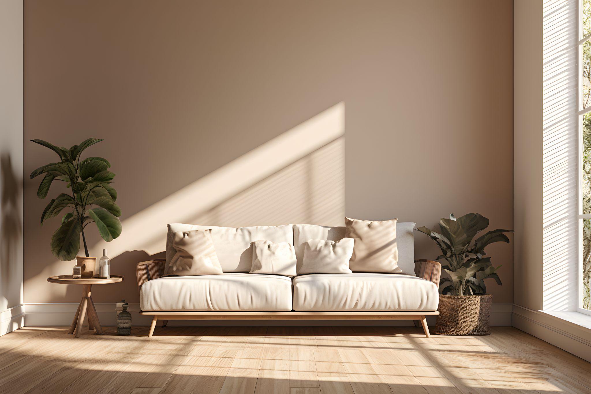
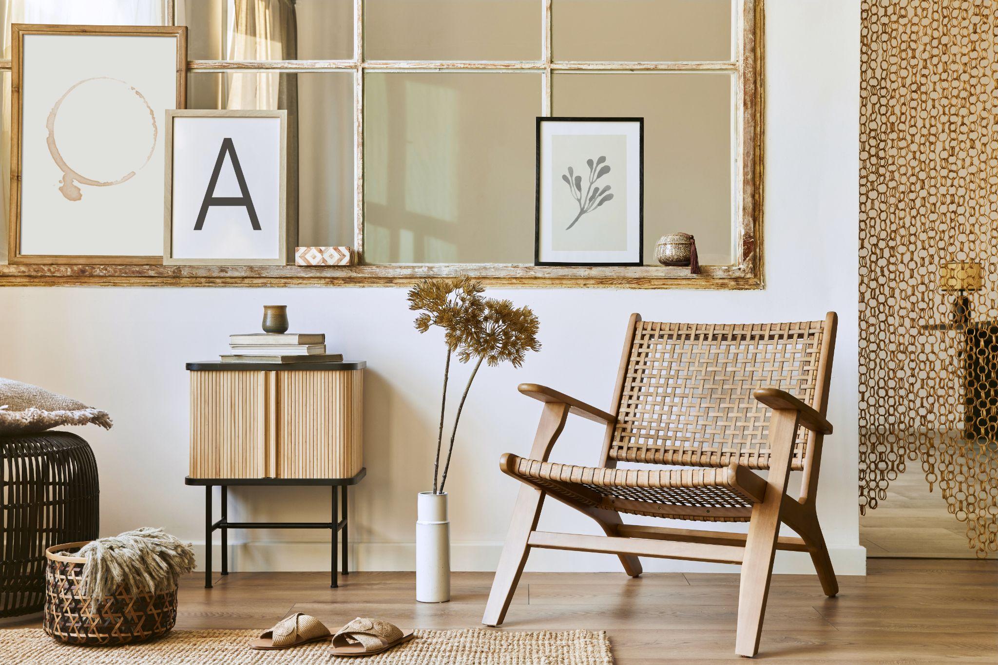
Beige, that poor maligned colour of yore, is having quite the renaissance. But forget the bland beiges of years past. Today, we have complex and nuanced beiges with earthy undertones, lending an understated elegance. From sandy taupes to warmer greys laced with beige, they create the ideal foundation for layering patterns and textures.
3. The Enigmatic Greys
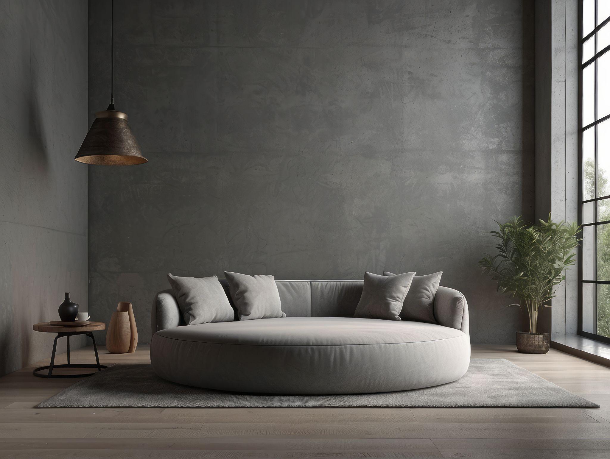
Akin to the classic “little black dress” in fashion, think of grey as its interior design counterpart. From cool, crisp pale grey for a clean, contemporary feel to a deep brooding charcoal, its versatility is astonishing. Grey provides a sophisticated anchor upon which to build your interior dreams.
4. Black: The Unexpected Neutral
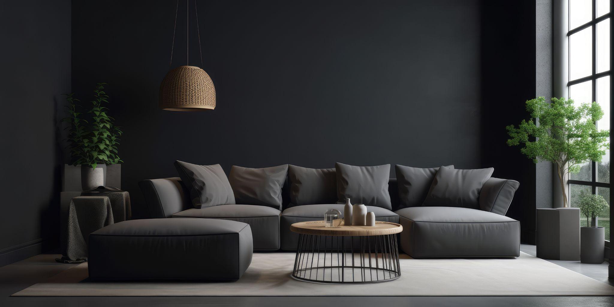
Yes, indeed! While black might initially seem audacious, used strategically, it can be a surprisingly adaptable neutral. Consider a black accent wall for a striking focal point; a black door for a touch of drama, or perhaps black cabinetry to inject a bit of gravitas into your kitchen. It has the power to ground a space, exuding effortless chic.
5. Earthy Browns

Often overlooked, a lovely brown offers a comforting richness, drawing its inspiration from the natural world. Think shades like terracotta, rust, or a warm chocolate brown. These earthy tones bring a gentle warmth to a room, pairing beautifully with natural materials like wood and leather.
Embracing the Understated
While these “boring” colours may seem subdued at first, their potential lies in how they elevate your space without dominating it. They offer an almost infinite opportunity for layering textures, patterns, and curated accents. If your heart desires a home that radiates both serenity and a timeless quality, these unassuming hues may be the most transformative design choice you ever make.
Tips for Putting “Boring” to Beautiful Use
Focus on Texture: Layering various textures becomes vital when working with a neutral palette. Picture the tactile appeal of nubby linens, a handwoven throw, the natural grain of wood, or the sumptuousness of velvet. This textural interplay adds depth and stops your space from feeling monotonous.
Layer Your Lighting: Good lighting is essential in any home but is perhaps paramount when working with a subtle palette. Incorporate a mix of ambient, task, and accent lighting. Each layer creates warmth, dimension, and visual interest. Consider making a statement with a show-stopping light fixture – it can become the focal point of the room.
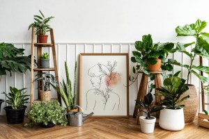
Embrace Natural Elements: Introducing elements of the outdoors – houseplants, a woven basket for storage, a piece of driftwood on display – breathes life into a neutral space. These natural materials beautifully complement those “boring” base colours.
Metallic Accents: A hint of brushed brass, the gleam of a silver tray, or perhaps a copper pendant light can introduce an air of sophistication without shouting for attention. Don’t be afraid of a bit of subtle shimmer to catch the light and create points of visual interest.
Don’t Neglect Artwork: Against a neutral backdrop, your chosen artwork truly takes centre stage. Whether it’s an arresting abstract piece, a calming landscape, or a playful collection of framed photographs, let them inject personality. Artwork not only provides a much-needed focal point but becomes a reflection of your unique tastes.
These colours also blend perfectly with design styles such as Scandinavian or Mid-Century Modern.
A Final Word
I believe, most importantly, your home should embody your individual spirit. If an exuberant explosion of colour and pattern brings you joy, then by all means, fly your fabulous flag! However, if you long for tranquillity and a timeless aesthetic, neutral interior design colours offer an exceptional foundation for creating a haven that is at once beautiful and deeply restful.
Sometimes, as in interior design and many things in life, the simplest elements can orchestrate the most extraordinary transformations.
Follow our social media for more DESIGN content – FACEBOOK – INSTAGRAM – we’re now on Pinterest!