Harnessing the Power of Colour: Your Guide to a Transformed Home
We needn’t be professional decorators to grasp the impact of a freshly painted room. Yet the magic of colour extends far beyond mere cosmetic enhancement. When thoughtfully applied, it possesses the ability to fundamentally alter the atmosphere of your home and even influence your very state of mind. If you’re seeking to breathe new life into your living spaces, let us explore how to unlock the extraordinary power of colour.
The Psychology of Colour
Understanding colour psychology is the first step. Before reaching for the paint pot, let’s dedicate a moment to deciphering the language of colour. Different hues evoke remarkably distinct emotional responses. Consider the following:
Reds: While they can be invigorating and passionate, used liberally, reds run the risk of feeling overbearing.
Blues: Known for their serene and calming qualities, a touch too much blue can slip into coldness.
Yellows: Uplifting and cheerful indeed, but proceed with caution where overly bright shades are concerned.
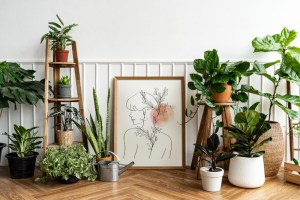
Greens: Evocative of nature and tranquillity, though darker variants might create an overly ponderous mood.
It’s prudent to contemplate the purpose of each room in your home. A dazzling red might create a sensational accent in the kitchen but would prove far too intense for a restful bedroom.

The Warm and Cool Divide
Beyond a colour’s specific emotional impact, you must grapple with the broader concepts of ‘warm’ and ‘cool’ tones. Warm colours possess subtle hints of red, orange, and yellow, lending an inviting and cosy air. Cool colours, with their underlying notes of blue, green, and purple, create a sense of spaciousness and relaxation.
Consider the natural light available in each room. If the sunshine rarely greets a north-facing room, warm colours can create a sense of cheerfulness that it may otherwise lack. On the other hand, rooms bathed in natural sunlight might benefit from the tranquil balance of cooler tones.
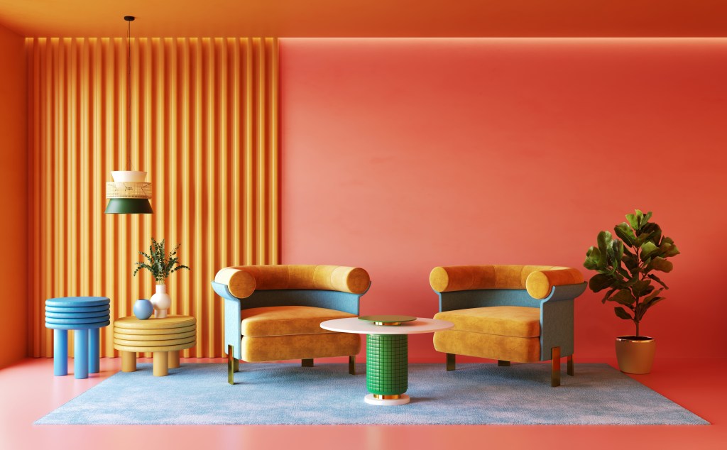
Harmonious Palettes and the 60-30-10 Principle
If the nuances of colour theory make your head spin, fear not! The time-honoured 60-30-10 rule provides an excellent starting point. Here’s the idea – select three colours for your room:
60% Dominant Colour: This becomes your anchor and will likely stretch across your walls.
30% Secondary Colour: Often a complementary choice for larger furniture pieces and fixtures, this shade adds interest and dimension.
10% Accent Colour: Your opportunity to inject bursts of personality through cushions, artworks, or statement objects.
Deciding on your specific palette is simplified with traditional colour wheels, or explore the plethora of online tools offered by many of the best-known paint brands.
Colour: Canvas Unlimited
It’s tempting to associate colour exclusively with wall paint, but remember, you can infuse your home with vibrancy in endless ways:
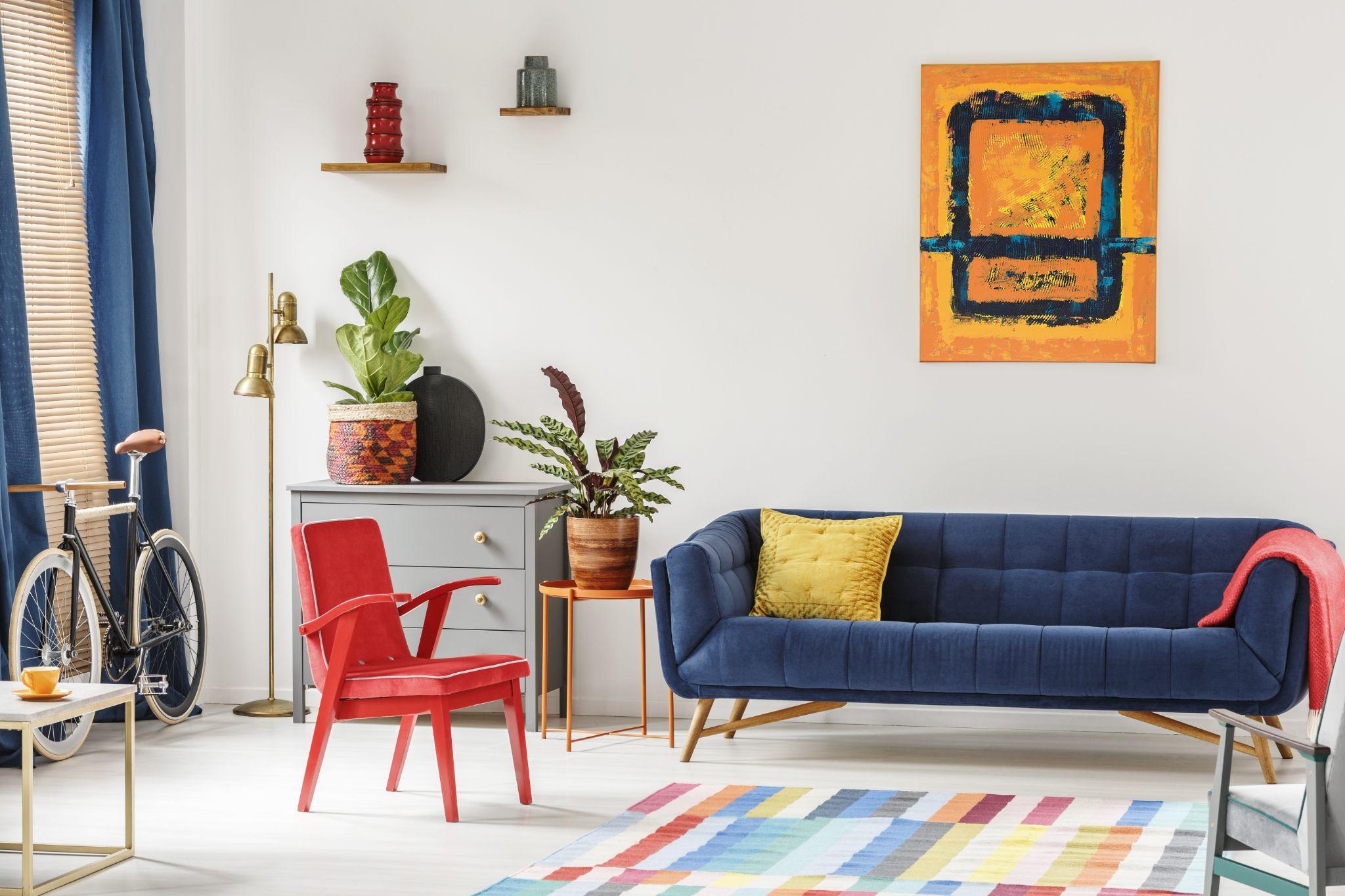
Statement Furniture: A daring sofa upholstered in a rich, sumptuous shade can become the focal point of an otherwise neutral room.
Soft Furnishings: Throws, cushions, and rugs are a superb way to experiment with colour without fully committing to a repainting project. These elements can be updated with the turn of fashion or the changing seasons.
Textiles: Patterned curtains, blinds, and even lampshades are easy and engaging ways to introduce dynamic pops of colour.
Upcycling: Before discarding old furniture, consider a splash of bright paint for a truly unique, eye-catching piece.
Artwork: A vibrant composition can elevate an entire space without necessitating permanent changes to your walls or décor.
Colour Transitions: Achieving Flow
If you’re repainting the entirety of your home, devote some consideration to how your colours will harmonise from room to room. A smooth, natural flow is preferable to jarring transitions. One elegant way to achieve this is through the use of varying shades of the same colour throughout your home.
Of course, your home’s architectural bones and inherent character play a starring role in your colour plan. Period details can be beautifully emphasised by cleverly contrasting colours, while a modern build with clean lines may lend itself to a more restrained palette.
Texture: The Unsung Hero
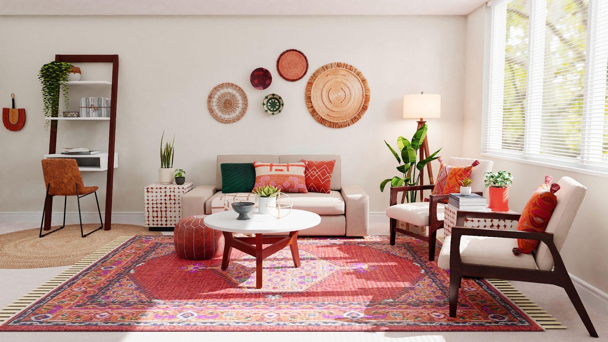
We must not forget, colour is more than a choice of paint finish (although the significance of that element should not be underestimated!). Texture plays a monumental role in how colour is experienced within a space. Imagine the visual intrigue of a deep plum velvet sofa or a woven rug in natural, earthy shades – both bring a sense of depth, dimension, and sophistication to your use of colour.
Illumination: Colours Inseparable Companion
The right lighting will either make or break your meticulously chosen palette. Always consider how the colour of your lightbulbs impacts the perception of your chosen shades. Natural light provides the most accurate impression of colour, so where possible, assess paint swatches in daylight for the truest evaluation. However, it’s essential to acknowledge the variations between light sources.
Incandescent Bulbs: These emit a warm, slightly yellowish glow that will enhance the warm tones in your colour scheme but may render cool colours a bit murky in appearance.
Fluorescent Bulbs: Often cast a bluish tinge, which can dull the appearance of reds and oranges. Selecting paint colours with cooler undertones is a way to balance a room with fluorescent lighting.
LED bulbs: Offer the greatest versatility, available in a wide spectrum of tones from ‘cool white’ to ‘warm white’. Choosing a warmer tone can mitigate any harshness in rooms needing cooler-toned paints.
Task lighting and accent lighting shouldn’t be forgotten either. A dedicated reading nook might benefit from focused, warm light, while strategic uplighting on an intriguing architectural feature creates drama and depth, particularly when a contrasting paint colour defines the space.
Intrepid Experimentation
If you’re ready to take a bolder leap in your colour explorations, don’t let conventional ‘rules’ confine you. Consider expanding your horizons in stylish and exciting ways. For example, the technique of ‘colour drenching’ involves the use of a single colour throughout a space – walls, furniture, and even accents – in similar shades. This creates a dramatic, immersive atmosphere, particularly effective when using deep, rich colours.
A statement wall in a single, dazzling colour can add instant pizzazz to an otherwise neutral room. Think vibrant turquoise, burnt orange, or rich violet – a fearless splash that transforms the space. And don’t underestimate the power of your ceiling! Often treated as an expanse of white, your ceiling is a ‘fifth wall’ that can be integrated into your colour scheme. A subtle shade slightly lighter than your wall colour can create the illusion of height, while a bolder choice creates a uniquely dramatic effect.
The Wellspring of Inspiration
If you find yourself in need of ideas, remember, inspiration blooms all around you! Nature remains a timeless source – from the blazing palettes of a sunset to the muted tones of a peaceful landscape or even the minute details of a wildflower. Capture it with a photograph to serve as the foundation for your décor.
Interior design publications (like ourselves) are treasure troves of inspirational homes. Seek out images that resonate with your personal style. Even textiles can be a catalyst for ideas. A patterned cushion, a woven rug, or a breathtaking painting might hold a vibrant colour palette that translates beautifully into the design of your room. And if you’re still feeling uncertain, pay a visit to your local paint store and simply explore the myriad of colours on display. You might not end up using those particular shades, but the process may well guide you towards the colours that speak to you.
Yours, and Yours Alone
Above all, remember that the sheer beauty of colour lies in its subjectivity. There are no universal rights or wrongs in its application, and trends ebb and flow like the tide. Colour psychology is just a framework. Be guided by your own joy in selecting colours that evoke happiness, that transform your home into a sanctuary that is completely and uniquely ‘you’. Colour is a formidable tool in your home design journey. With thoughtful planning and a dash of playful experimentation, you can create spaces that are not only visually stunning but also reflect your personality and nourish your spirit every day.